Velvet fabrics need some special shader setups to look realistic. Since these effects are caused by thousands of fibers reflecting the light in different ways, it’s not easy to replicate the look exactly, but we can get close.
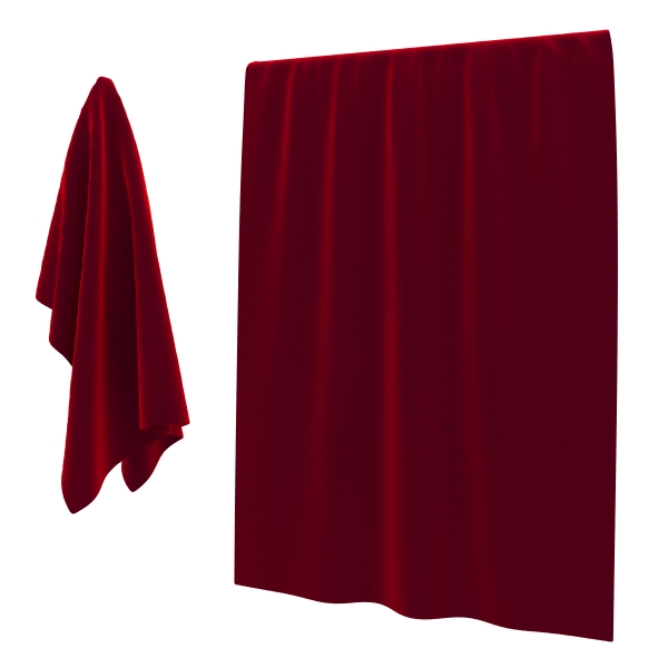
Take a look at a reference image for basic velvet, to see what we are trying to achieve.
The main feature of velvet is that it has strong highlights that are perpendicular to the viewing direction (should be on the edges of the shader ball in the material editor). Since we know that this effect can be achieved with a Falloff map, that’s what we are going to use.
The color in the areas pointed towards the viewer is a very dark red, which becomes gradually lighter as the surface changes its relative angle. It will become very bright as the surface points in a direction that is perpendicular to the angle of view.
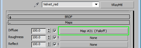
Assign a Falloff map to the Diffuse slot and try to replicate this look.
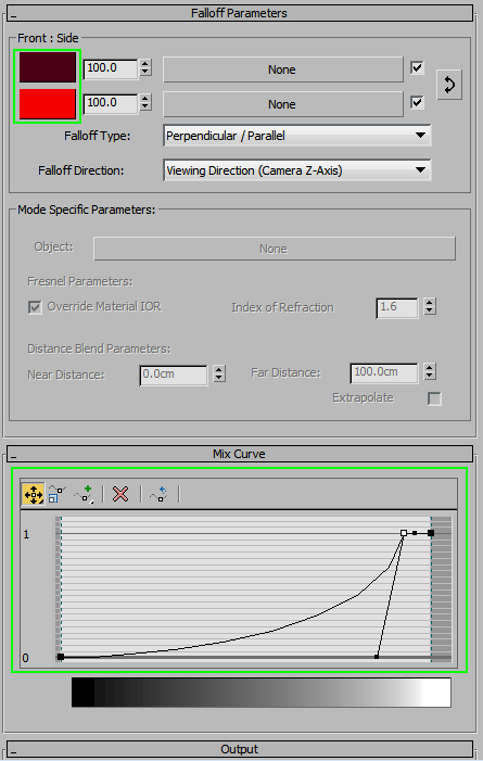
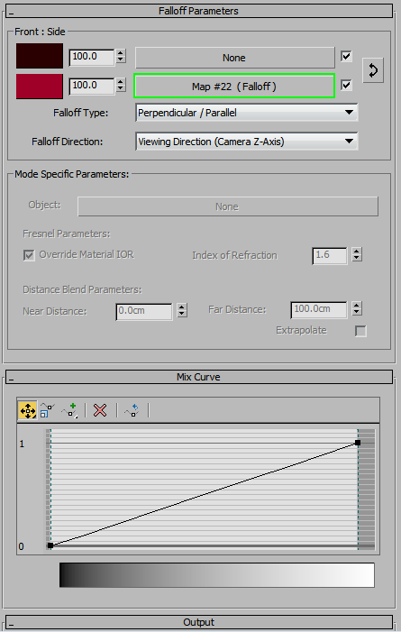
Falloff settings: notice the modified Mix curve at the bottom. It allows precise control over how the colors are blended together.
While this is a step in the right direction, it seems to be lacking depth. The problem is that it is not possible to define the whole range of colors using only two swatches. To get around this problem, we are going to combine two Falloff maps.
The first map will look like this:
The second Falloff map goes in the “Side” slot of the first one. We can use it to control the colors and curve of just that side area, rather than the whole object. Take a look at the settings for the second map, and notice the bump in the curve near the right size- it’s going to give us a sharp, strong highlight.
The resulting render looks much deeper than it it did before.
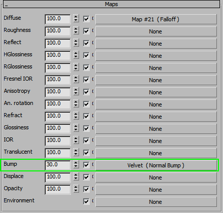
Add some Bump and we should have a basic material.
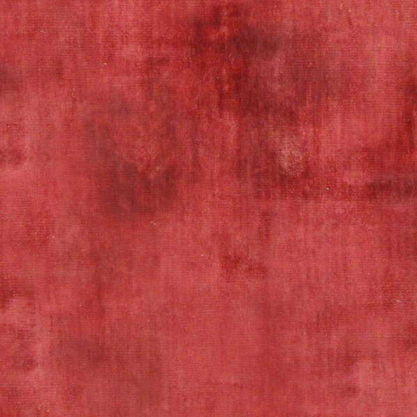
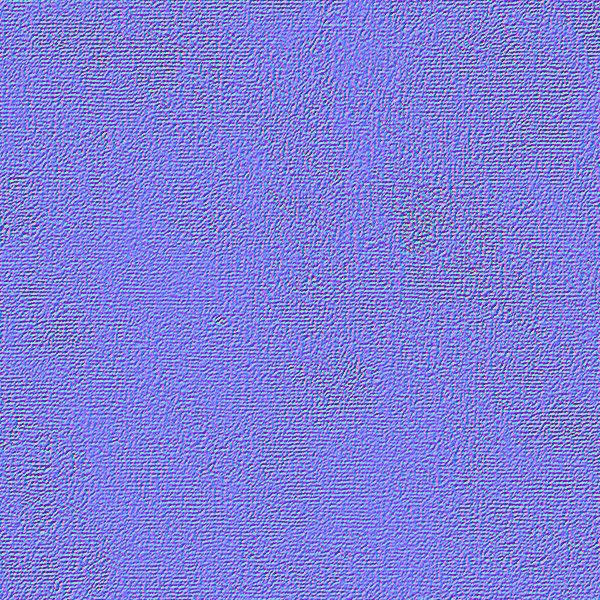
Generate a Normal map using Nvidia plugin for Photoshop. Below is the step-by-step process, starting with a tileable velvet texture. This way, we’ll not only get the weave of the fabric, but patchy changes in direction as well.
Desaturate the image.
Run a High Pass filter to get rid of the major dark and light spots.
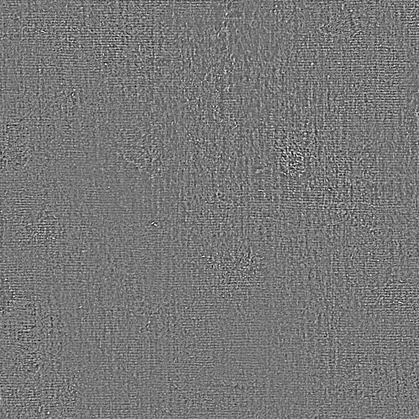
Increase the contrast using Levels.
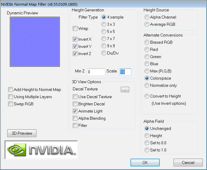
Run the Nvidia NormalMapFilter with the following settings:
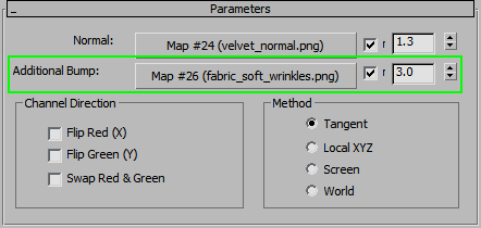
Assign a Normal Bump map to the Bump slot and use the texture we’ve just created, with Blur value of 0.75 and Strength of 1.3. Here’s what the resulting image looks like:
The result looks fine, but add the wrinkle map from the basic fabric tutorial to the second Bump slot.
If the result is too patchy, use a smoother image for normal map, or reduce the strength of normals. If it is too smooth, use a patchier image or increase normal strength. The shader is pretty flexible this way.
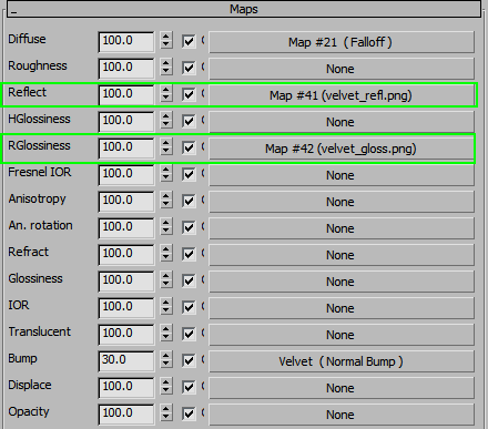
Finally, let’s add a Reflect map. There is a very small amount of very blurry reflections in the material.
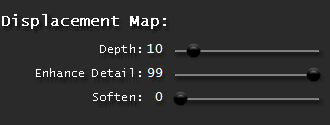
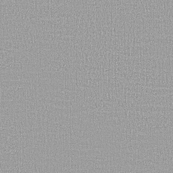
Run the velvet normal map through CrazyBump with these settings:
Open the generated heightmap in Photoshop and adjust the curves to get something like the example below. Save it as velvet_reflect.png
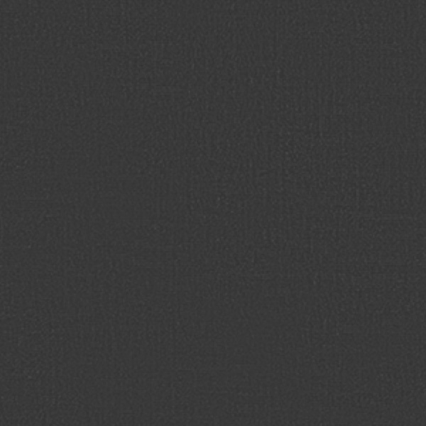
Add a Hue/Sat adjustment layer and make the whole thing brighter, just above the medium grey. This should do as the glossiness map.
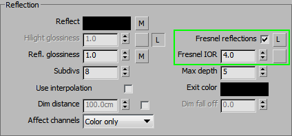
Set up the maps in the appropriate slots and turn on Fresnel reflections. Set the IOR to 4.
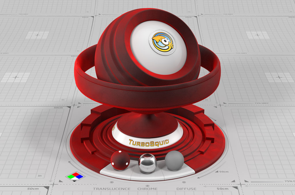
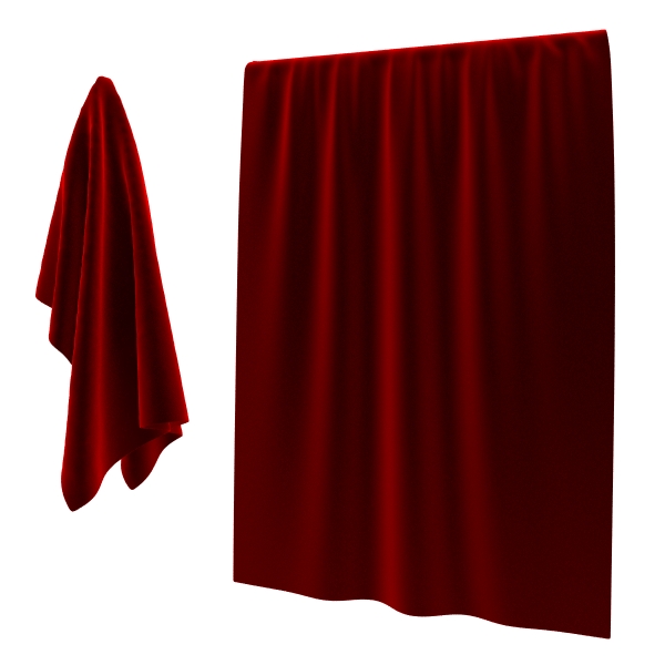
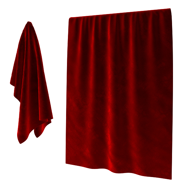
And here is our final velvet material.









Comments
Very nice!