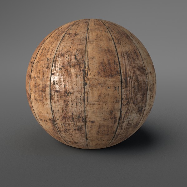
Distressed wood can have many different looks. There are countless variables at play here: the original finish of wood; age; impact from the environment; mechanical damage; dirt and grime; etc.. As you can see, it would be impossible to cover all possible scenarios, so I here are some general guidelines.
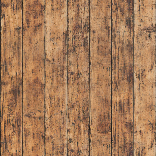
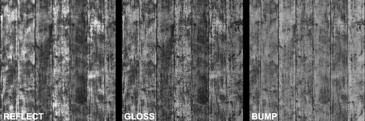
When looking at this image, it seems that the wood used to have some sort of oil or lacquer finish. Now it’s aged quite a bit and there are few darker patches where the finish has worn off altogether. That should be reflected in other maps as well. In Bump, those areas might be slightly lower; in Reflections, they are probably less reflective and more blurry.
A good rule of thumb is to vary the glossiness and reflections a bit more than it is visible in the Diffuse. Try taking a dirtmap or two and blend it over the b&w diffuse map. This helps to simulate some random, oily staining on the surface, as well as some areas that are the same color as the rest of the wood that have been polished by either something rubbing against them or being compressed by accidental bumps or other types of strong pressure.