Intro
Since the goal of StemCell is for models to work across multiple platforms, using correct texture map values is extremely important. Creating textures for StemCell shouldn’t drastically change your texturing workflow. Once you have an understanding of how different maps contribute to the render output, it will be easy for you to assign the correct texture map values.
The StemCell spec requires you to use two texture map sets: Specular and Metallic. The Specular workflow texture maps are used for production applications such as 3ds Max and Maya. The Metallic workflow texture maps are used for real time rendering applications such as Unity and Unreal Engine. Once you are able to do one workflow accurately, it is possible for you to convert those maps in Photoshop to use within the other workflow.
We have created this guide to help you understand both workflows and to offer tips that you can use while working on your content.
Dielectric vs Metallic
There are generally only two types of materials when it comes to texturing: Metals (conductors) and non-metals, which are also called dielectrics (insulators). Metals usually appear highly reflective and/or with colored highlights. Dielectrics are generally characterized by glossiness and grayscale highlights. They basically represent almost any non-metallic material that you see in the real world.
Some examples of metallic and dielectric materials include:
- Metallic materials: iron, steel, gold, aluminium, etc.
- Dielectric materials: wood, glass, cloth, plastic, etc.
When you set your Index of Refraction (IOR) or create your metallic maps, some materials may be difficult to classify. This is because you are limited to creating the outer surface. This is not a common occurrence, but materials such as metal protective coatings, lacquers, oils, and roughness can change the appearance of a surface. This will affect your values.
The first step before creating any texture is to determine what type of material you are trying to create. Next, you should consider surface finish and detail. Using reference images will help you to set a clear goal for how your material should appear.
While creating each map, you should keep in mind your intended surface-type. A best practice is to always create your textures in the same order. This helps you to maintain value consistency. When setting your values, you should consider only the final outer surface of the intended material.
IOR vs Metallic Map
The Specular workflow for production renderers like V-Ray and Arnold use Index of Refraction (IOR) to determine how light reflects and refracts when hitting a surface. In regards to reflection, the higher the IOR, the more overall reflectivity the surface will have. By using IOR, you can control whether your material appears as a dielectric material or as a metal material.
- Dielectric materials have lower IOR values ranging from 1-3. Most materials will fall between 1.4 and 2. Values over 2 are usually used to create very polished non-metal surfaces, which makes them highly reflective.
- Metallic materials have higher IOR values ranging from 8-30. With metals, you have a much broader range to work within. Basically, 30 is a perfect chrome material and 8 is closer to a raw, unfinished metal.
There are many tables available on the internet that you can use as reference for baseline values. It is important to remember that those values are calculated using perfect laboratory conditions. Your IOR values may vary slightly depending on wear, dust, finish, and other conditions that may change the surface’s reflectivity.
The Metallic workflow does not offer a form of Index of Refraction (IOR). This limits how much control you have over reflectivity of a material. If you use a Metallic value to control reflectivity instead of IOR, this can help you achieve better material results. Metallic maps are mostly described as black and white maps only, defining 100% metal or 100% dielectric materials. This is the simplified core concept, but in practice, you can use more grayscale values. Real world conditions create a lot of variables that can change how a surface appears. Since the Metallic map also has a significant effect on how the BaseColor map is interpreted, this simplified approach may not provide you with the best results.
Set the metallic value of the base material. Think of the Metallic value as similar to setting IOR like you do in a production rendering software such as V-Ray or Arnold. There are optimal value ranges that react in the same regard to IOR.
- Dielectric materials usually have lower IOR values from 1-3. The Metallic equivalent for Dielectric material values range between 0.02 and 0.30. If painting your Metallic map or checking the values this range is between 2% and 40% black.
- Metallic materials usually have higher IOR values from 8-30.The Metallic equivalent for values range between 0.70 and 0.98. If painting your Metallic map or checking the values this range is between 75% and 98% white.
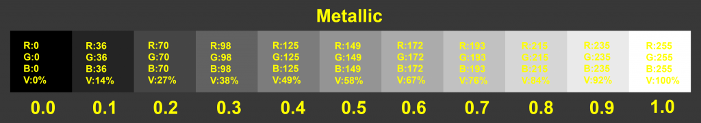
The image above shows linear values from 0.0 to 1.0 and the corresponding RGB value.
Try not set your Metallic values below 0.02 or above 0.98. Because of how the Metallic map controls the BaseColor, values outside of this range can cause inconsistencies between different applications
Diffuse and Specular vs BaseColor
In a Specular workflow, the Diffuse map strictly affects the base displayed material color. This has no effect on other material properties like reflectivity since reflectivity is controlled by the Specular Map. This map controls both color and level that the reflection will have.
Dielectric materials have all the color in the diffuse and grayscale specular values. Metallic materials have a dark diffuse colors and get their color from the Specular map.
As a general practice keep Diffuse and Specular map values between 5 and 230. Going above this range can cause bright values to blow out in different renderers. Any values lower than this range can clamp to black which gives no color contribution.
The Specular value should not be lower than the Diffuse value. If you use a Specular value that is darker than your Diffuse value, highlights will disappear or create dark artifacts. Realistically everything, including matte materials, has some form of highlight.
In a Metallic workflow, the BaseColor is a combination of the Diffuse and Specular map. The Metallic value determines how much of the BaseColor map is interpreted as either a Diffuse output or a Specular output. Areas on that map that are more metallic (white) will result in more reflected color.
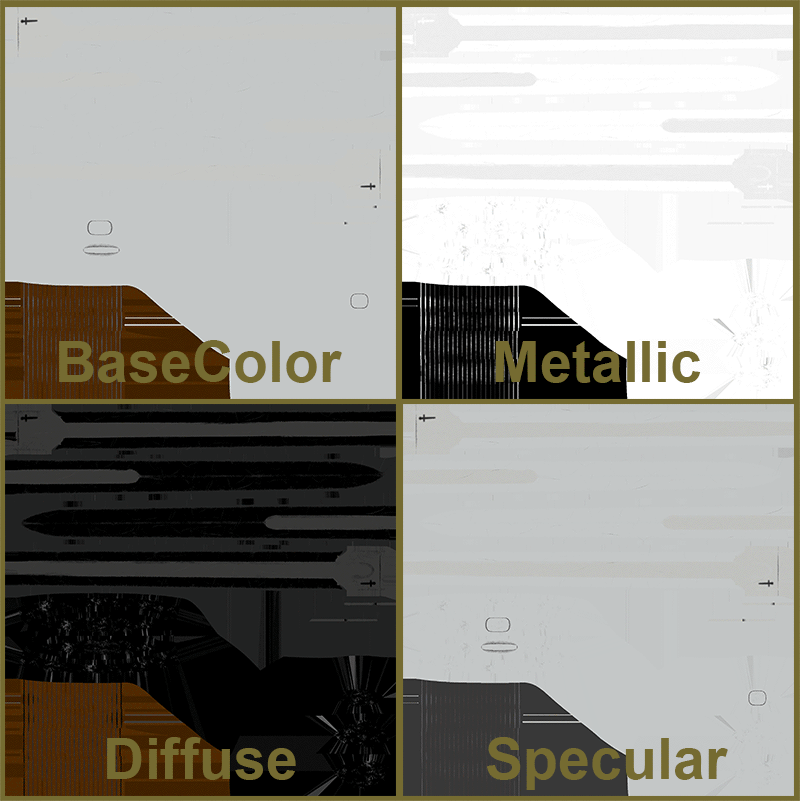
The BaseColor map contains both the dielectric material values from the Diffuse map and the metallic material values from the Specular map. The Metallic map identifies these areas.
As the metallic value increases, the BaseColor value is split between Diffuse and Specular contribution. The interpreted Diffuse value is darkened with a black value while the interpreted Specular value is a gray that is blended in with more of the BaseColor value.
- A metallic value of 0.0 means all color in the BaseColor map is interpreted as Diffuse contribution. The Specular contribution reads as a completely matte 22% gray value.
- At a Metallic value of 0.5 the Diffuse and Specular maps display as nearly 50% of the BaseColor value for each.
- At a full Metallic value of 1.0 there is no Diffuse contribution value, which is equivalent to a pure black. The BaseColor value displays as 100% value to Specular map contribution. This is illustrated on the image below.
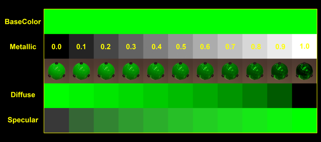
As the metallic value increases notice how the the interpreted Diffuse and Specular values change in relation to the BaseColor which remains constant.
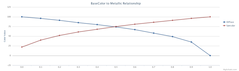
This chart illustrates the rate at which map contribution values are interpreted as metallic value increases (shown in the previous image). Note the more rapid transitions when Metallic values change from 0.0 to 0.1 and 0.9 to 1.0.
It is important to note that having a 0% black or 100% white Metallic map value can cause inaccuracy in your other map values. This is because you will only have a matte surface reflection value or a completely reflective surface. Since the initial reflectivity of the material is out of range, the Roughness and BaseColor have to compensate for that reflectivity. This can lead to inconsistent values, even between similar surface materials.
Glossiness vs Roughness
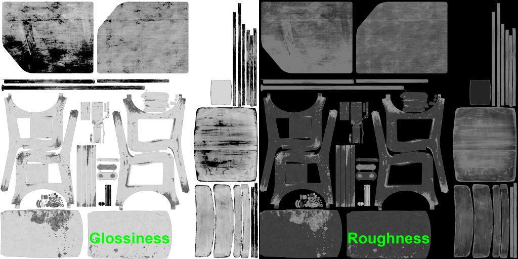
Both Glossiness and Roughness are grayscale maps. The values of these maps determine the microsurface properties of the material. These maps have the most impact on how a material feels. The values determine whether a material is smooth and shiny like glass, or rough and grainy like sandpaper. It is important for you to ensure that these values are correct and consistent. This is the step where you add fine scratches, fingerprints, water spots, and so on. This microsurface detail is what gives the model character and a sense of reality.
Roughness is read as the inverse of Glossiness. Roughness interprets black as perfectly smooth and white as extremely grainy or porous. Glossiness interprets white as perfectly smooth and black as extremely grainy or porous. This makes converting from one to the other as simple as inverting the map and doing value adjustments to tweak it to your desired workflow.
When creating maps, it is important to remember that no surface is perfectly smooth in real world conditions. Also, it is rare you would exceed a 50% value when making a surface rougher in either workflow. At a 50% value, light hitting that surface is nearly completely diffused leaving only soft highlights. Realistically all materials have at least a subtle highlight. If you exceed a 50% value, the material can appear to absorb light, which is unrealistic.
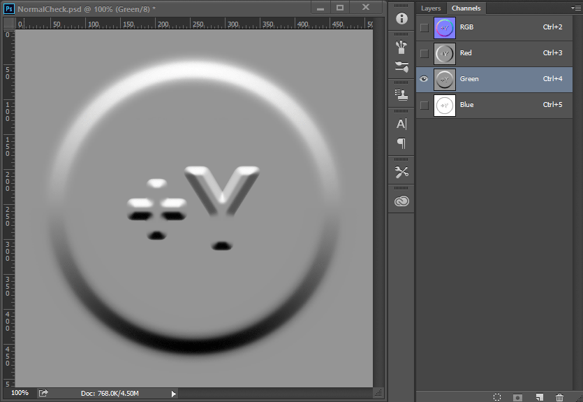
DirectX vs OpenGL
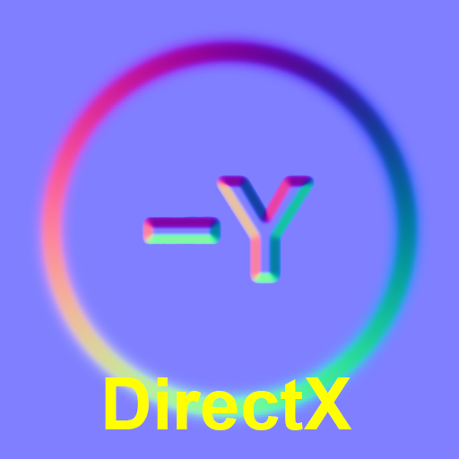
When talking about Normal Maps it is common to hear the terms DirectX and OpenGl. This is in reference to how an application interprets the normal map. OpenGL reads values as Y being up or positive. DirectX reads values as Y being down or negative. To switch between the two is as simple as inverting the green channel. Some applications and renderers have this as a menu option for normal maps. Others do not have an option at all, in which case the channel needs to be flipped on the map directly.

| Application | Normal Map Direction |
| 3ds Max | DirectX (-Y) |
| Maya | OpenGL (+Y) |
| Unity | OpenGL (+Y) |
| Unreal | DirectX (-Y) |
| Marmoset | OpenGL (+Y) |