1 Introduction to V-Ray Materials
V-Ray Materials are the main workhorses for creating shaders in V-Ray. 80% of the time it is all you need to create realistic results that also render quite fast. It is optimized to work with all other aspects of V-Ray (lights, GI, sampling, etc.), so it should always be used instead of 3ds Max native materials.
In addition to this document, we’ve also provided over 70 tutorials on specific V-Ray materials so you can see specific examples.
2 Main Components
Generally, the main components of a CG shader are:
- Diffuse
- Reflection
- Refraction
- Bump
These are the names that V-Ray uses. They may have different names in different renderers, but the functions are pretty much the same.
Diffuse gives the basic color to the shader, Reflection controls how the shader reflects light. Refraction controls how it lets the light through. Bump simulates a distortion of the object’s surface.
With the exception of the Refraction, the other 3 components should be present in all materials.
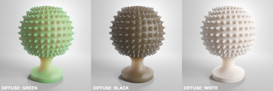
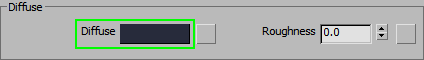
2.1 Diffuse
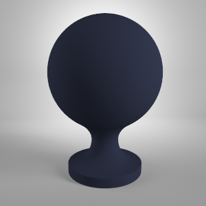
The easiest way to understand Diffuse is to think of it as the color of the object. For example, what color is a ripe, common tomato? Red! So the Diffuse color of a tomato is a red color.
2.1.1 Adding Realism with Variation
But wait!
Most objects have a multitude of colors in them. Even the tomato has a light green patch where the stem connects to the fruit and the red is not the same in all spots. It could be more pink on the bottom and slightly greenish on the top. Most of the time you should use an image (a Texture or a Procedural Map) to define those colors. Even objects like a blue plastic ball are not perfectly blue a couple of days or weeks after they leave the shop. Everything gets a bit dirty or faded out there in the real world.
The obvious exception to this is if you are creating shaders for studio renders of product design, where everything has to look like it just came out of the packaging box – clean, shiny, perfect. In this case you may use solid colors as the Diffuse of your VrayMtl. Use your judgement and decide whether the material needs to be super slick for a studio render, or a bit used to make a believable real-world scene.
2.1.2 Setting up the Diffuse (2.2 gamma Workflow)
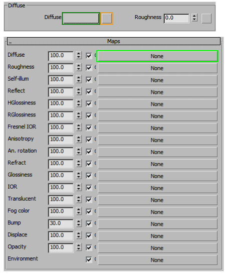
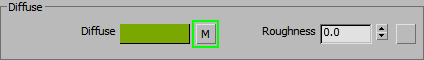
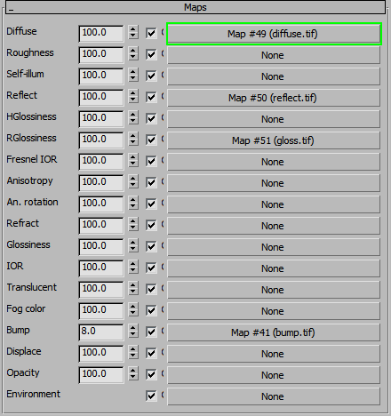
You can either use a color by clicking on the color swatch (green rectangle), or you can set up a Map by clicking on the small square next to the color swatch (orange rectangle). You can also scroll down to the Maps tab and assign the texture there. Most Maps in V-Ray work this way.
If you are working by eye and accurate colors are not required, choosing the color from the 3ds Max color picker is fast and easy, and it works. The problems start when you want to match a color from an external application like Photoshop. If you choose the same RGB value in both applications the results will be different (if you are using proper gamma 2.2 setup in 3ds Max).
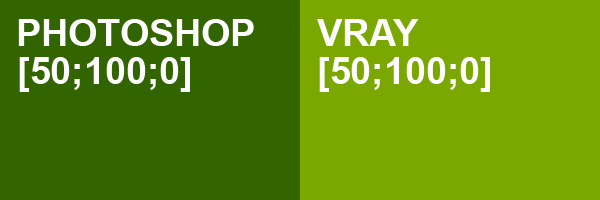
Set the same RGB values in the color slot and change the Gamma correction settings to “Specify” and make sure it’s set at 2.2
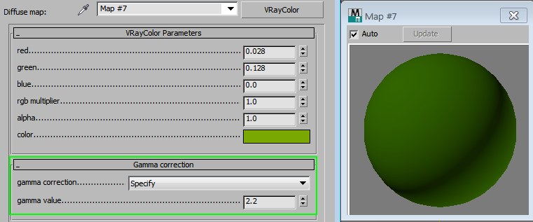
Now the color of the material matches perfectly with the color you took from Photoshop.
This seems a bit complicated for just getting a simple color in 3ds Max, but currently there is no automatic way to do this.
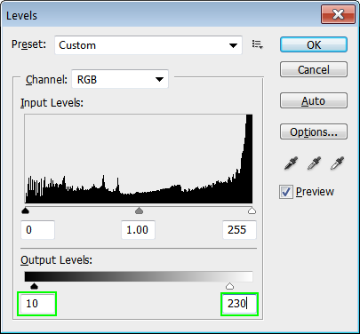
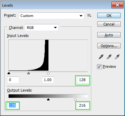
Important note – for realistic results, the Diffuse must use colors or textures in the range of 10~230 on the lightness scale. Most things we think of as pure white are actually ~75%-90% white (190-230). The whitest snow has only 90% albedo (reflectance rate). The same goes for the blacks, only black holes absorb everything; the rest of the world reflects at least a small portion of the light. Even the darkest coal has an albedo of ~4%. Using overbright colors will not only look non-realistic, but it will also increase the render times, as the light needs to be bounced around more.
The 10 to 230 range is for Photoshop textures and VrayColor gamma corrected colors. If you use the regular color picker, the range gets converted to about 1~205.
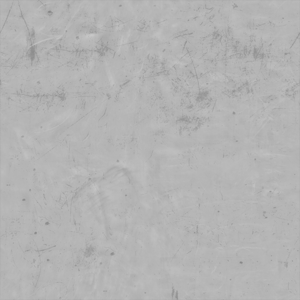
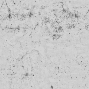
If your Texture image has brighter or darker areas, it’s easy to fix using the Levels tool in Photoshop, just move the Black point to 10 and White point to 230 like in the example image.
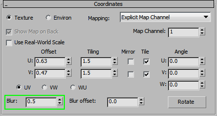
2.1.3 Using Bitmaps and Understanding Filtering
Now let’s try using our adjusted Bitmap in the Diffuse slot.
This blur is caused by Texture Filtering. It is used to avoid more artifacts on small, sharp patterns by blurring everything.
Obviously, this is not at all what we want. We want nice, crisp renders.
There are a couple of ways to solve this problem.
Or you can disable the filtering altogether in the Bitmap Parameters tab. This works just as well for making everything sharper, but is not as flexible. Most of the time, you can try reducing the Blur so you can keep at least some control over the softness of the texture.
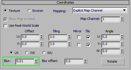
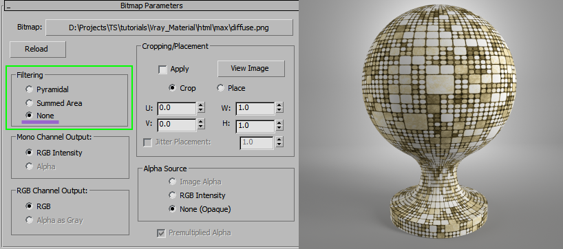
It is very important to reduce blur or turn off filtering for all the textures you are using. Especially so with the Diffuse and Bump textures. If you do not do this, there will be parts of your render that will look ‘blurry,’ not to mention losing the fine details in textures. Keep in mind that sometimes results might be too sharp. In that case, slowly increase the Blur value until the render looks good.
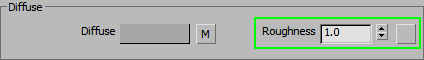
2.1.4 Diffuse Roughness
There are not a lot of materials where it is useful, but some most common examples could be chalk and dust. Higher values – flatter look, use your eyes to make a judgement on how much the materials needs it.
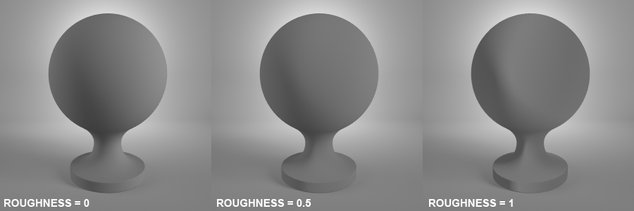
2.1.5 Diffuse Color vs. Refraction/Reflection Color
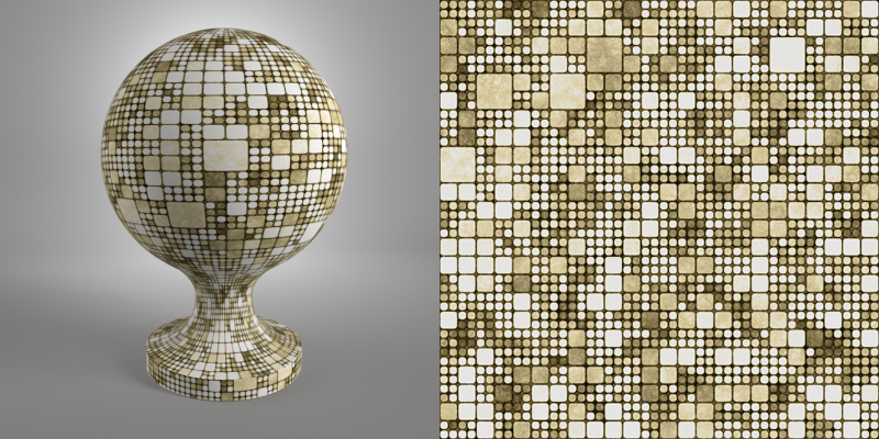
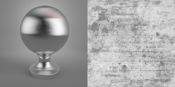
The most common examples are metals and glass. For extremely Reflective/Refractive materials, use near black as the Diffuse color [1;1;1;] If the material is ‘aged’ you can increase the lightness a bit, but try to stay in dark grey area of the lightness scale. This is just a general guideline, sometimes you might need to give a bit of a color tint to a metal (or glass) to match your photo reference, but still – start with near black and adjust it only if necessary.
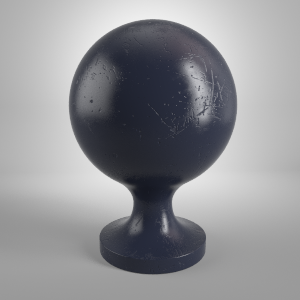
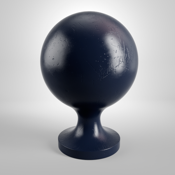
To illustrate this example, here’s a gold material. To the left you have an incorrect approach with yellow Diffuse and yellow Reflections, to the right you have a physically correct look with near black Diffuse and yellow Reflections.
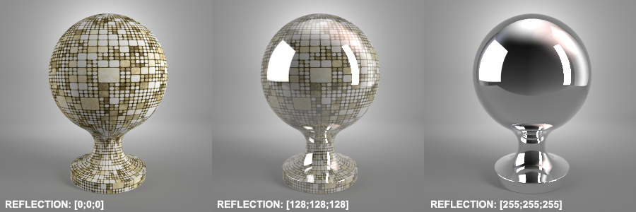
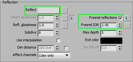
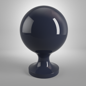
2.2 Reflection
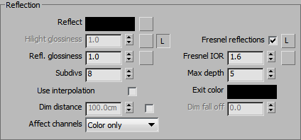
Perhaps it can be easier to understand how the Reflection works, if you imagine it as a layer on top of the Diffuse. At 100% strength [255;255;255], it shows pure reflection of the environment, lights, etc. Use a darker color and the Diffuse starts to show through. Drop it down to pure black and only the Diffuse is visible. It’s not actually as simple as that, but it is the general idea on how Diffuse and Reflection interact.
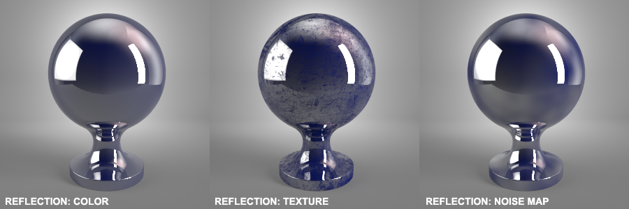
2.2.1 Adding Realism with Texture
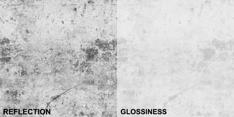
The Reflections (just like most other maps in V-Ray) can be defined by using a color, a map, or a texture. The same principle as with the Diffuse map applies – if it’s not a shiny, slick studio render, there are bound to be some imperfections in the reflection amount, so it’s best to use a Map or a Texture instead of a simple color.
Try to keep the Reflection value in the range from 1~230 for realistic results.
2.2.2 Always Turn on Fresnel
Ok, so why does our material look so artificial?
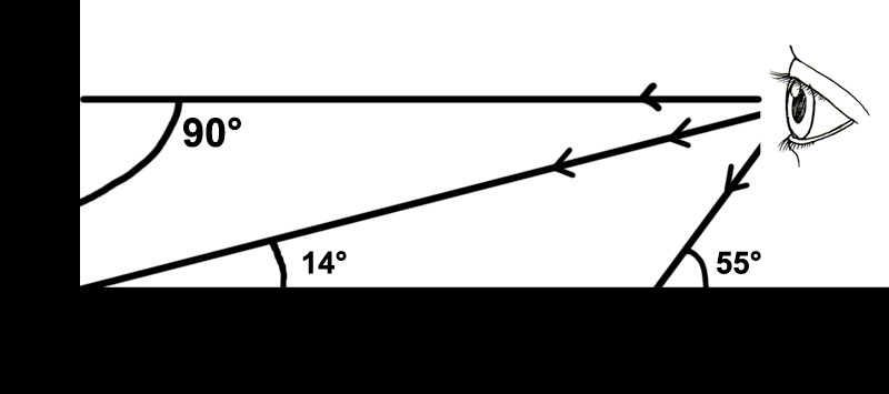
The problem lies in that it reflects the light equally at all angles. Real world objects have different strength of reflections, depending on viewing angle realtive to your line of sight. In general, the lower the angle, the stronger the reflection becomes. Even some materials that appear to be non reflective initially, reflect quite a bit, when they are near parallel to the direction you are looking at.
Let’s look at some examples…
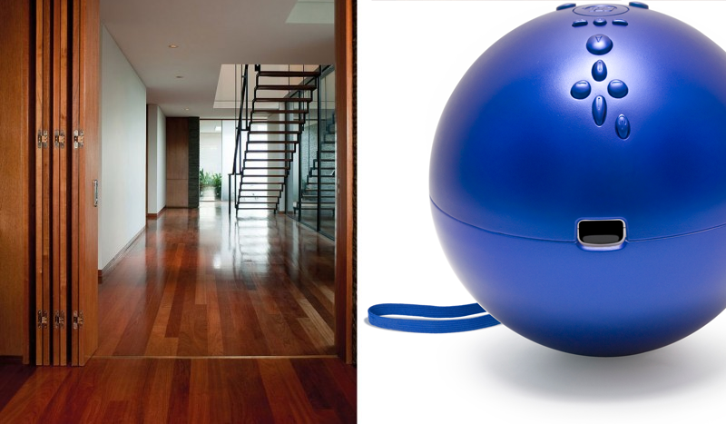
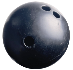
Notice how the reflection gets stronger as the floor goes further from the camera (or as as closer it approaches the edge of the bowling ball). The smaller the viewing angle, the stronger the reflection. If you look directly at something (90°), the reflection is much weaker than if you look at it with a small angle.
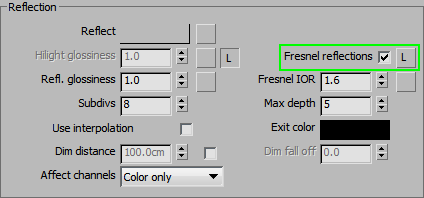
To imitate this effect in Vray, you can use the Fresnel Reflections option.
In general it is a good idea to use Fresnel for every material you create. The difference between chrome and concrete lies in the Fresnel IOR value. This value determines how exactly this reflection falloff occurs. To access it, turn off the L button. The default value of 1.6 is only good for glass and maybe some plastics.
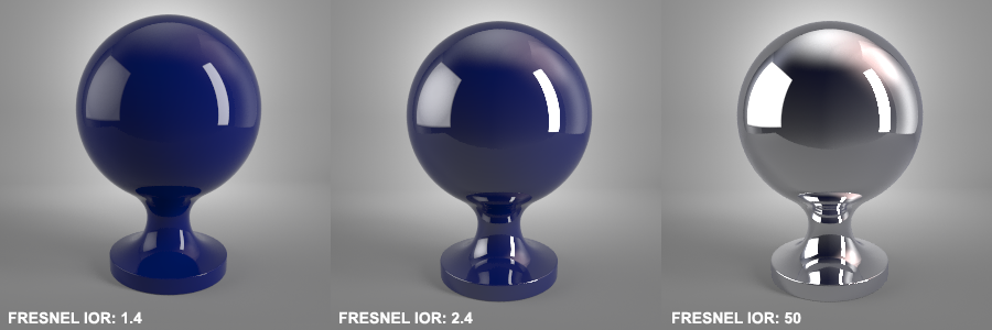
Below is a general guide on what values to use for different materials.
- water 1.33
- plastic 1.4-2.4
- glass 1.5-1.8
- diamond 2.4
- compound materials like wood, stone, concrete etc 3-6
- metals 18-100 (Though you should rarely exceed 40)
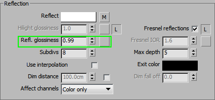
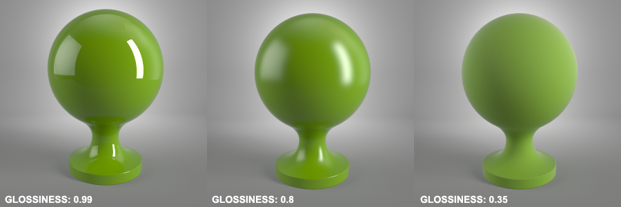
2.2.3 Reflection Glossiness
Decreasing glossiness makes the reflections blurrier. The effect is somewhat similar to taking a fine sandpaper to our shader and roughing the surface up. This comes with a cost, though: the more blurry your reflections get, the harder it is for Vray to calculate them, thus, the result is noisier and the render time increases. For very rough surfaces, try not to go lower than 0.35.
This gives us a useable range of 0.35-0.99
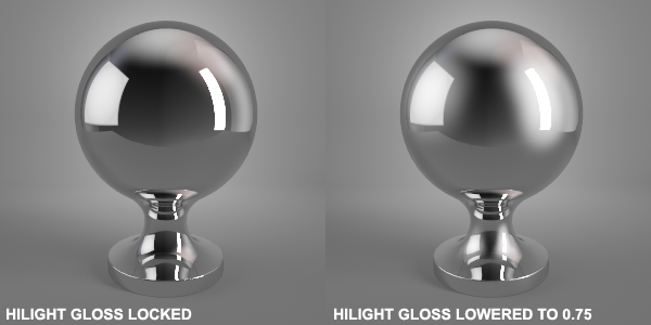
2.2.4 Unlinking Specular and Reflection Glossiness
This little cheat helps us simulate that look without increasing the render time. There are no rules on how much to lower the HiLight Gloss, so use your eyes to make that judgement. Generally, a difference of 1.0 to 1.5 works well.
2.2.5 Using Texture To Drive Glossiness
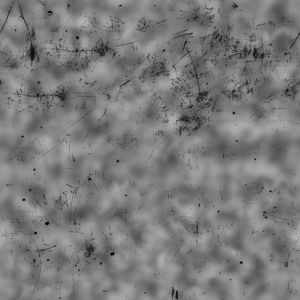
As soon as the object leaves its packaging and a person touches it, the reflections are no longer equally glossy. The areas that are touched by hands or scuffed against something rough are slightly more blurry from oils or scratches, or any other interaction with the world. Use a texture or a map instead of a simple color. It can have very little variation in brightness, but it is important to pay attention to these little details. Otherwise, the result will look artificial.
Generally, it is a good idea to derive your glossiness map from the reflection map (you can overlay a different texture to make it more interesting). The areas that are less reflective will probably be slightly more blurry as well. This is not a hard rule, so you can break it as long as the result looks believable.
This example still needs some Bump to look realistic, but we’ll get to that a bit later.
This setting determines how many samples Vray can use to clean up the noise in blurred reflections. Basically, it means more samples = cleaner reflections.
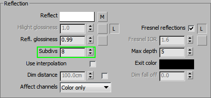
Note – most V-Ray users prefer to use the Adaptive DMC sampler for rendering their images. This means that the actual number of samples needed for a clean image changes depending on the DMC settings. 1/4 will need lower values than 1/100. Since you cannot know which render settings will be used by other people, we recommend leaving this value at the default 8 subdivs. Everyone has their own workflow and will adjust it accordingly. Otherwise, it can get frustrating hunting down a material with a too-high subdiv count that doesn’t work with a particular render setup.
2.2.6 Reflection Depth and Exit Color
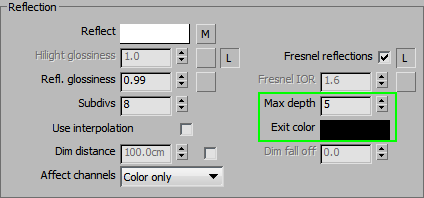
This option sets how many times the reflection is traced before it is converted into the exit color. This helps to speed up the renders by reducing the amount of calculations Vray has to do for reflections. Here’s an example with exit color set to blue.
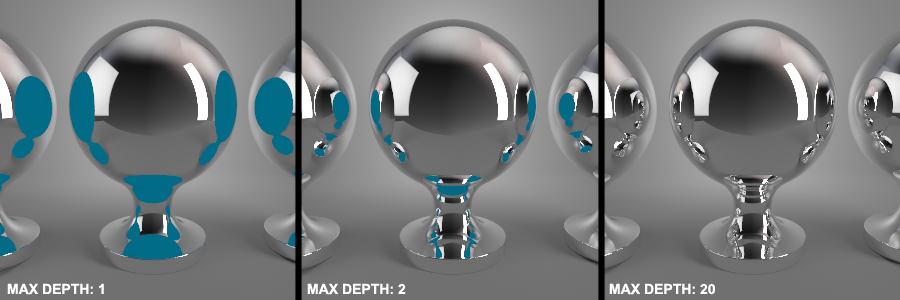
The default settings work well most of the time. If you have a lot of mirrors or other reflective objects, you might need to increase the max depth. Going higher than ~20 is usually unnecessary.
If your material has blurry reflections, you can make it render a bit faster without losing quality, by reducing the Max Depth as follows:
- Glossiness 0.9-0.99 = max depth 5
- Glossiness 0.8-0.89 = max depth 4
- Glossiness 0.7-0.79 = max depth 3
- Glossiness 0.6-0.69 = max depth 2
- Glossiness 0.35-0.59 = max depth 1
Since the reflections are blurred, there will be no negative effects on the image. The values we’ve provided are more like a rough guide, so you can adjust them if needed.
2.2.7 Lesser Known Parameters
2.2.8 BRDF
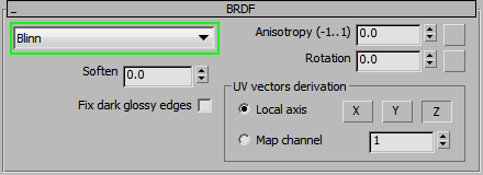
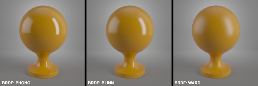
As you can see, the main difference is in the way they treat highlights. Phong is the sharpest, Blinn is a bit more blurred, and Ward much softer.
There really is no rule as to when to use what, but generally, use Ward for metals and anisotropic materials; use Blinn or Phong (whichever you prefer) for the rest. The only exception: it is not recommended to switch to Ward for metals is if the metal is highly polished (very sharp reflections, like chrome, gold jewelry, etc.).
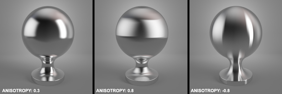
2.2.9 Anisotropy
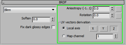
Anisotropy should be set in an interval between -0.99 and 0.99.
Values of -1; 0 and 1 will not do anything.
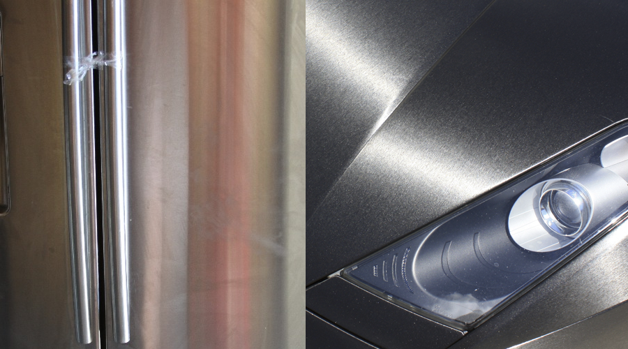
The effect becomes stronger as the value approaches 1 (or -1). The difference between negative and positive values is the direction of the stretching. Positive values stretch reflections horizontally (simulates vertical scratch pattern). Negative values stretch the reflection vertically (simulates horizontal scratch pattern).
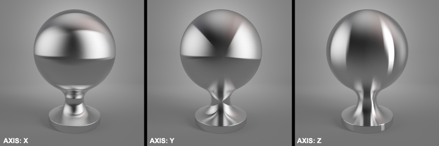
For even more control, you can choose the axis that is used for calculations
For it to work correctly, Anisotropy needs blurred reflections. If your Reflection glossiness is set very high, the effect will not work.
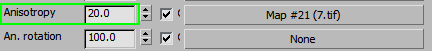
Just like with other aspects of Vray, we can use Maps or Textures to drive the Anisotropy parameters as well.
You can use an Anisotropy texture with reduced strength to fine tune the exact amount of imperfection it introduces. Keep in mind, that texture maps only work as Positive values, so it’s best to combine them with positive Anisotropy strength. For example, we’re using Anisotropy 0.6 + 20% of a texture. The result looks a bit more natural than just pure Anisotropy.
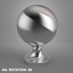
Rotation maps can be used to change the direction of the simulated scratches. It’s good for creating things like circular patterns or metallic flakes that reflect light in random directions. Smooth gradients make the rotation gradual, while patches of different colors make the transitions sharp, with each shade of gray having a different rotation value.
2.2.10 The Options Tab (Reflections)
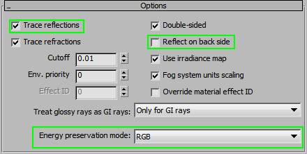
The outlined options are all affecting the Reflections.
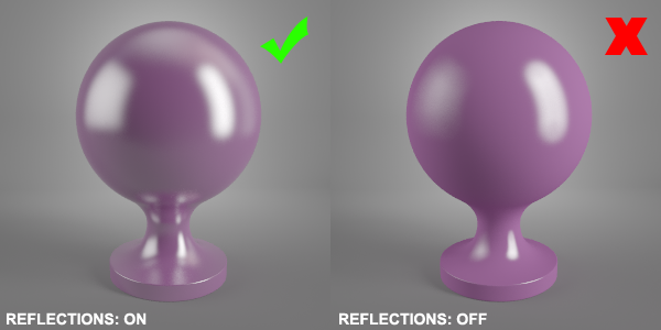
First of all, never turn off the Trace Reflections option, since it is essential for a realistic result. If you turn it off and use only the fake specular highlights, reflections are just that – round, fake highlights, regardless of the shape of the lights and the environment.
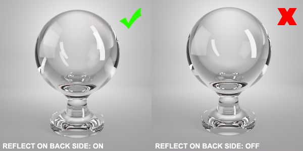
Next is “Reflect on back side.” By default, it is turned off. That’s fine for most materials, since it helps to cut down on the render time. However, if you are creating glass or other transparent materials, you have turn this option ON. Otherwise the result will not look realistic.
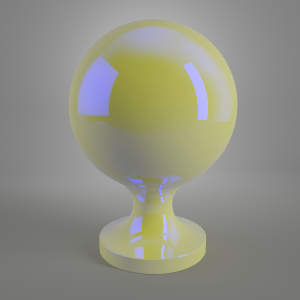
The Reflection amount is subtracted from the Diffuse color. For example, lets take white Diffuse [230;230;230] and blue Reflections [0;0;230]. So, what do we get when we subtract? We get Yellow [230;230;0]. And that is exactly what we see when rendering this particular example.
2.3 Refractions
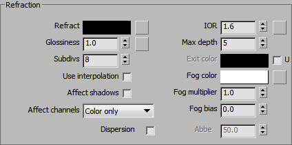
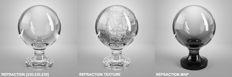
The amount of Refraction can be controlled by a number, Map, or a Texture. It can be grayscale or colored, but it is recommended to stick to grayscale for realistic results.
If you are not using Caustics in your scene (most likely, you aren’t) turn on the “Affect Shadows” option to get realistic, transparent shadows. Otherwise, the shadows will be too dark.
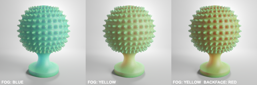
2.3.1 Adding Color To Refraction
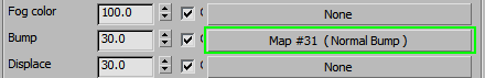
How do we actually get colored refractions, if it’s not recommended to use colors in the Refraction amount? Use the Fog color option. It works in a more realistic way, since thicker parts of the model will be more colored/darker than the thin parts.
Depending on your object’s physical size, you might need to adjust the Fog Multiplier Value. Larger objects will look darker than smaller ones when using the same material. It is the way it’s supposed to work and it’s physically accurate.
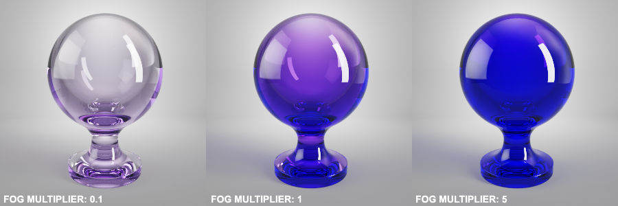
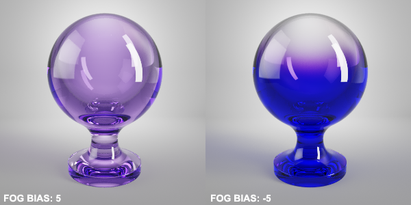 Use Fog Bias to control the color transitions. Lower values make the color more intense and the transitions sharper, while higher values make the tinting more even and weaker. If you adjust both of these parameters, Fog multiplier and Fog Bias, you should be able to achieve any effect you might need.
2.3.2 Refraction Glossiness
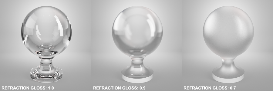
Refraction Glossiness simulates a rougher up surface by diffusing the light rays in different directions. Lower values create a rougher look (frosted or sand-blasted glass, or textured, rough plastic), higher values are for smooth surfaces. Since glossy Refractions are one of the biggest increases for render times, they are usually used in a smaller range. It’s usually not necessary to go lower than 0.7 to achieve the desired look.
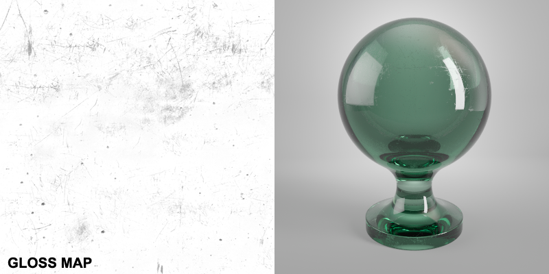
You can use a Texture to create a rougher, more realistic look. If the material is still pretty clean, don’t overdo it and use a map that is mostly pure white with some darker spots/patches. It’s usually a good idea to keep the Refraction Glossiness map similar to the reflection glossiness. Any rougher areas would affect the Reflections and Refractions in a similar way.
Note – similar to Reflections, it’s best to leave the Subdivs at 8 for the end user to adjust themselves.
2.3.3 Refraction Depth and Exit Color
The Refraction Depth and Exit color function exactly the same as their Reflection counterparts. Bump up the max depth if there are a lot of refractive/reflective objects, and bring it down if you’re using blurry Refractions.
2.3.4 Refraction IOR
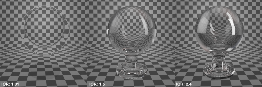
IOR is a very important parameter to set correctly for your material to look believable. Fortunately, these values have been calculated for all sorts of materials, so there’s no need to guess here.
With the Value of 1 (same as air), the rays of light are going straight through the object without any distortion, as you raise the number higher, the rays get distorted more and more.
- Acetone 1.36
- Agate 1.544
- Air 1.0002926
- Alcohol 1.329
- Amber 1.546
- Amethyst 1.544
- Crystal 2.00
- Diamond 2.417
- Emerald 1.576
- Ethanol 1.36
- Glass 1.51714
- Glass, Albite 1.4890
- Glass, Crown 1.520
- Glass, Crown, Zinc 1.517
- Glass, Flint, Dense 1.66
- Glass, Flint, Heaviest 1.89
- Glass, Flint, Heavy 1.65548
- Glass, Flint, Lanthanum 1.80
- Glass, Flint, Light 1.58038
- Glass, Flint, Medium 1.62725
- Ice 1.309
- Jade, Nephrite 1.610
- Jadeite 1.665
- Methanol 1.329
- Moonstone, Albite 1.535
- Nylon 1.53
- Onyx 1.486
- Opal 1.450
- Plastic 1.460
- Plexiglas 1.50
- Polystyrene 1.55
- Quartz 1.544
- Quartz, Fused 1.45843
- Rock Salt 1.544
- Ruby 1.760
- Sapphire 1.760
- Tiger eye 1.544
- Topaz 1.620
- Tourmaline 1.624
- Turpentine 1.472
- Turquoise 1.610
- Water 35′C (Room temp) 1.33
- Zirconia, Cubic 2.170
2.3.5 Breaking the Rules
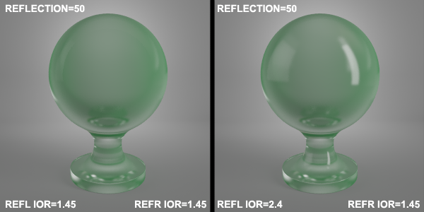
Technically, both the Reflection and Refraction IOR should be the same, but sometimes, you might want to unlock them for artistic reasons. This trick is used when a glass or transparent plastic material just seems to lack reflections. In this case, bumping up the Reflection IOR can help in bringing out those reflections. It’s also useful when you want to create a more even distribution of the reflections, without increasing their intensity.
2.3.6 Dispersion
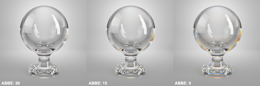
Dispersion controls how the light is split up into different colors, when passing through an object. A classic example would be a ray of light going through a prism, creating a rainbow effect. Most glass and other refractive materials show at least a little bit of dispersion. The exact amount is controlled by the Abbe number (Google this for specific materials, for example, “diamond abbe number”). The basic idea is that as the Abbe number goes lower, the dispersion effect increases. It’s easy to overdo it, but it should actually be pretty subtle.
2.3.7 Refraction and Alpha Channels
For Refractive objects, it is generally a good idea to set the “Affect Channels” to “All Channels.” This way, your alpha channel will not be solid white, but it will get adjusted depending on the transparency of the object. (This is really useful to have for post-production.)
2.4 Translucency
It is possible to add Translucency to your VrayMtl, but we recommend using VrayFastSSS2 material if you need this effect. The reason for this is that it is a newer, faster interpretation of Subsurface Scattering that is also more adjustable.
If you do decide to use the Translucency in the regular Vray material, here are a couple of things to remember.
- The material needs to be refractive for translucency to work
- Set the IOR to 1
- Make sure that ‘Double Sided’ is turned Off in the Options tab
- Reduce the Refraction Glossiness to something like 0.15~0.5
- To define the outer color of the object, use the Diffuse color
To define the inner color, use Fog color, just like you would for refractive materials.
You can also additionally tint the inside of the material by using the Backface color.
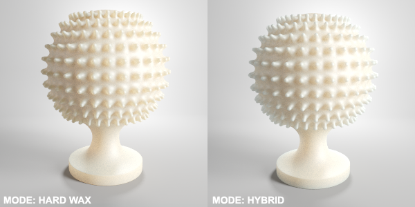
Stick to the Hard Wax or Hybrid type (soft water is just for legacy vray version compatibility).
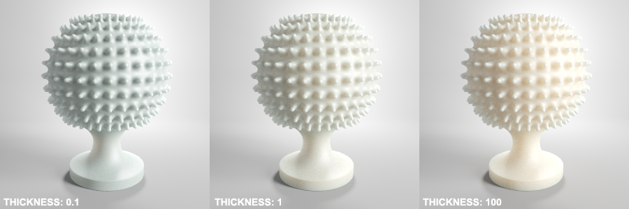
You can reduce the depth of the scattered rays by using the Thickness parameter.
Scatter Coefficient changes the way the light rays travel within the object. 0 means that the rays get scattered in all directions; 1 means the rays continue to move the same direction, as they did before entering the object.
Light multiplier allows you to change the strength of the light as it moves inside the object.
The amount of Refraction can be controlled by a number, Map or a Texture. It can be grayscale or colored, but it is recommended to stick to grayscale only for realistic results.
If you are not using Caustics in your scene (most likely you aren’t) turn on the “Affect Shadows” option to get realistic, transparent shadows. Otherwise, the shadows will be too dark.
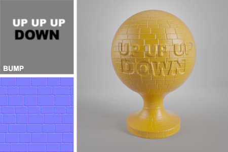
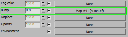
2.5 Bump
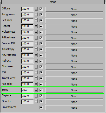
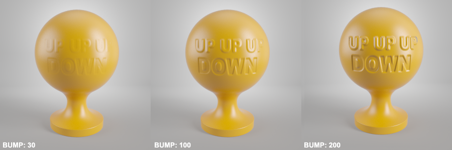
The way it works is very simple – you just add a Map or a Texture to the Bump slot and adjust the strength.
Medium gray [128;128;128] does nothing, while lighter values go up and darker values go down (relative to the surface normals).
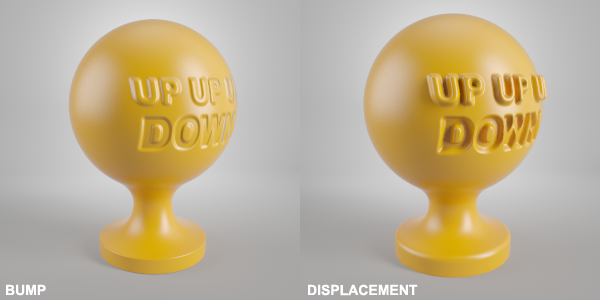
For very strong Bump effect or for situations where correct shape in the profile of the object is needed, it’s better to use Displacement (either in a material slot or as a VrayDisplacement Modifier). Bump is a fake effect, while Displacement produces actual geometry at rendertime.
Just keep in mind that displacement works only in positive direction, with black being the original shape of the object, while everything lighter than that gets displaced upwards.
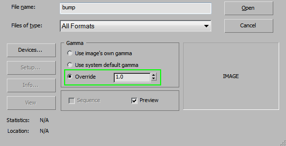
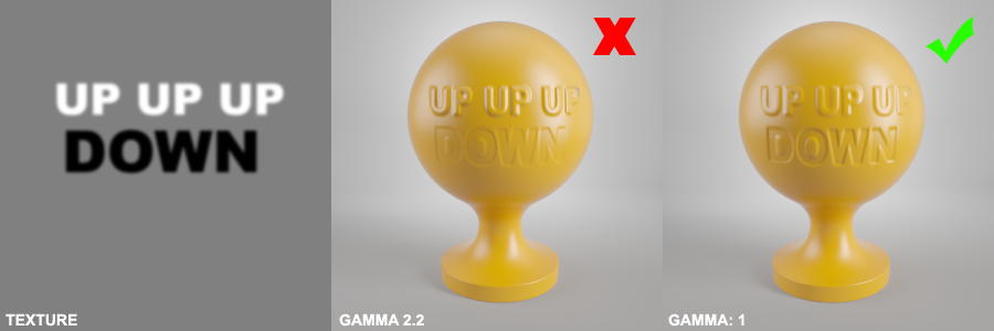
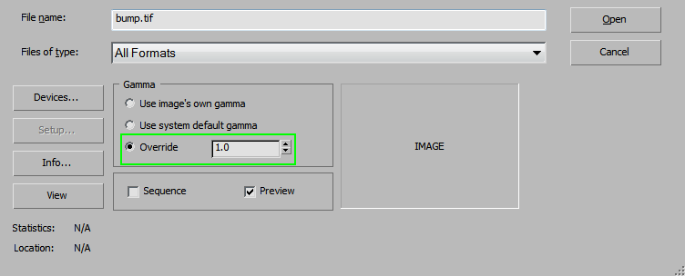
2.5.1 Be Mindful of Gamma
2.5.2 Normal Maps
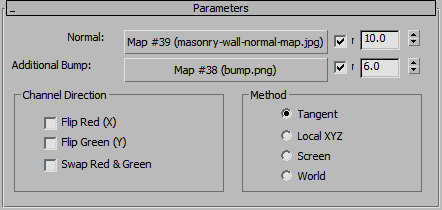
2.5.3 Boosting Realism
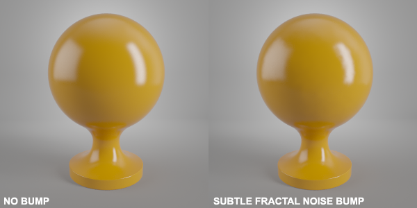
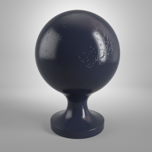
It is recommended that you add a Bump map to all the materials you create. It doesn’t always have to be strong or detailed. Sometimes a simple Noise map can help a lot in avoiding that ‘fake’ or ‘CG’ look.
3 Basic Workflow
It’s always a good idea to have a reference photo (or multiple photos) so you see what the end goal is. Don’t use a reference to make an exact replica, but as a guide to create a similar look.
3.1 Diffuse
3.2 Reflections
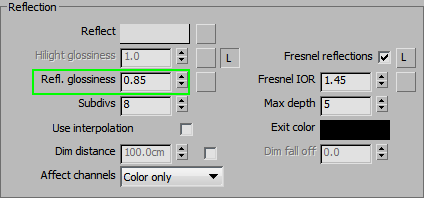
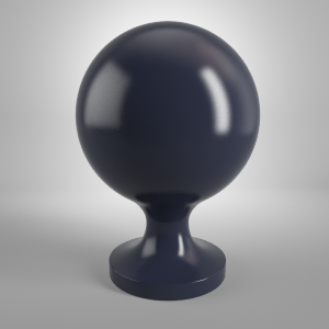
Estimate the general Glossiness at this point. The goal is to roughly match the size and shape of the highlights on the reference photo. Seems like 0.85 does the trick.
3.3 Adding a Bump Map
3.4 Adding a Reflect Map
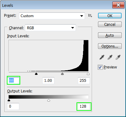
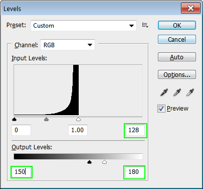
So take the bump map and adjust the levels so that the white point is at 180. Move up the black point to about 150. Since there are probably some areas that are also a bit dirty or oily, add another layer on top of this map with some patchy areas and set it to Overlay mode.
3.5 Adding a Gloss Map
3.6 Adding Complexity to a Bump Map
3.7 Adding Even More Texture
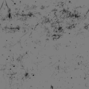
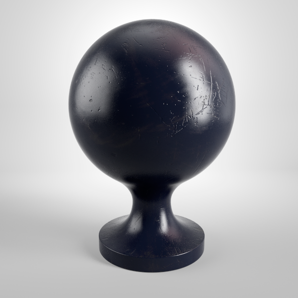
This looks about right. Perhaps the scratch pattern is a bit rougher than the reference image, but otherwise, it seems to look good.
3.8 Summary
Try to analyze your reference image and break it down into components: Diffuse; Reflection; Refraction; Bump. If something is not clear right away (for example, bump), add some reflections and it will be much easier to evaluate the other aspects. Everything goes hand-in-hand, so don’t forget to analyze how each element affects the others.
Special thanks to Austris Čingulis from Viscorbel.com for helping us create this material tutorial.